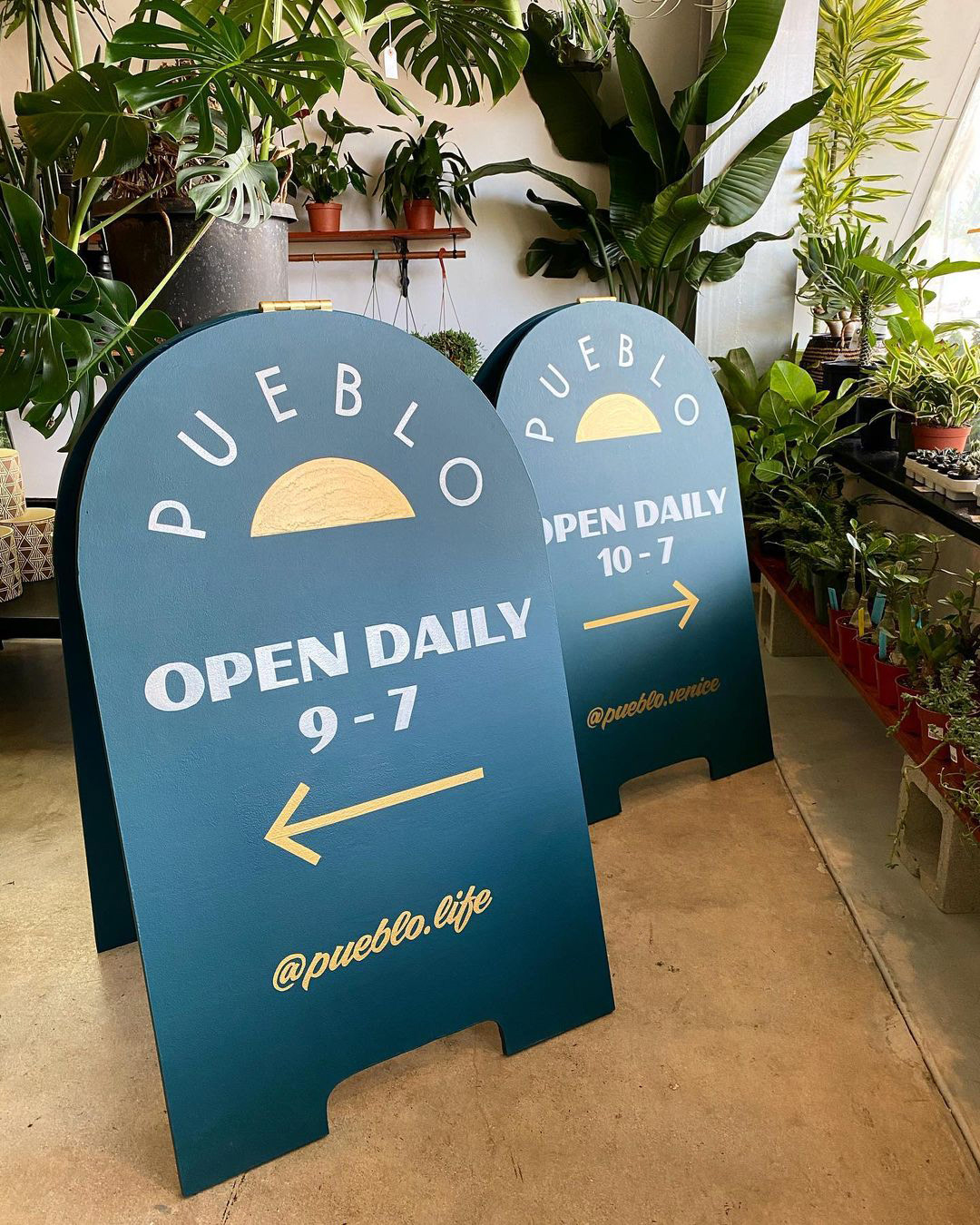
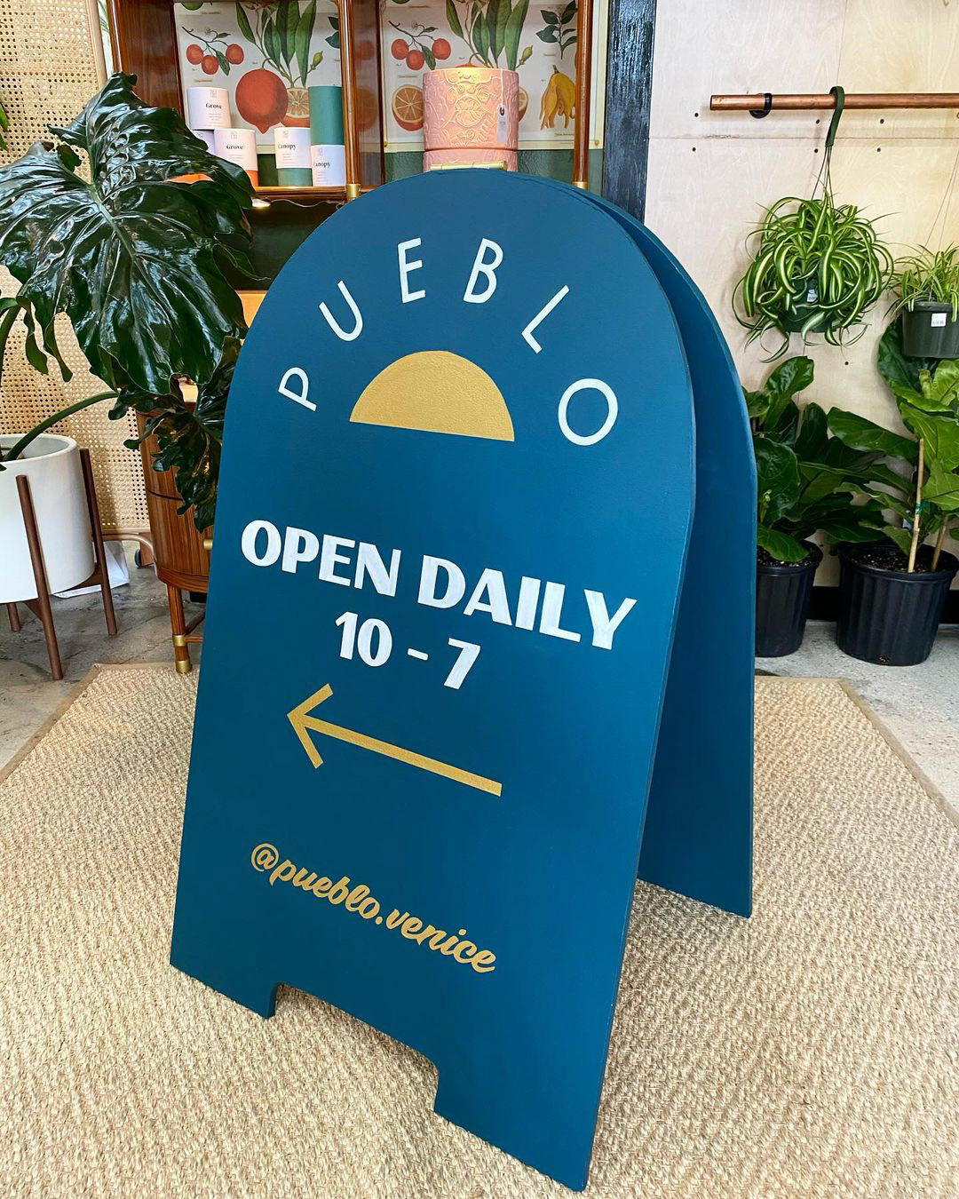
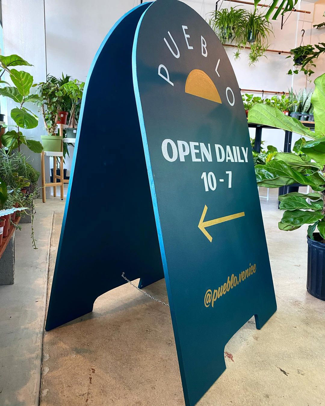
Pueblo is more than a name—it’s a way of life–with the namesake literally translating to community. As an LGBTQ+-owned and operated business, they cultivate community through their carefully curated indoor and outdoor plant nursery, with offerings selected to withstand the harsh desert climate. Beyond plants, Pueblo is a cafe, a garden, a gift and home goods shop, and offers landscape design services. They believe in sustainability, both for the environment and their people, providing a living wage to their core team and staying true to what they know best: Plants, People, and Place.
Visitors are invited to linger in the coffee garden, where Caffio Espresso Bar serves drinks from a one-of-a-kind VespaCar nestled among the greenery. Pueblo isn’t just a place to shop—it’s a gathering space. Each month, they host several types of events, including their beloved Garden Sessions, which offer cannabis enthusiasts a warm invitation to all to unwind and light up a different kind of plant from their usual offering in a safe environment with live music, delicious food, craft drinks, and an atmosphere designed for connection and relaxation.
They’ve also won Phoenix New Times’ Best Plant Shop in Phoenix for 2023 and 2024 👏
The following direction was part of a pitch for a versatile and modular logo that works in various spaces and shapes. Creative direction, branding, and design by Zach Bates. Ocelot illustration by Albert Barroso.
They’ve also won Phoenix New Times’ Best Plant Shop in Phoenix for 2023 and 2024 👏
The following direction was part of a pitch for a versatile and modular logo that works in various spaces and shapes. Creative direction, branding, and design by Zach Bates. Ocelot illustration by Albert Barroso.
