Design + copy. Visit the live Home page. Notable contributor + collaborator: Chris Misterek.

Pricing page design

Design Market page design
Design + copy. Visit the live Pricing page. Notable contributor of development: Jessica Reklaitis.
Design + layout/grid/preview system. Visit the live Design Market page. Notable contributors of development: Kat Randall + Keegan Lambert.
Design, copy + development. Visit the live Industries page.

Designers
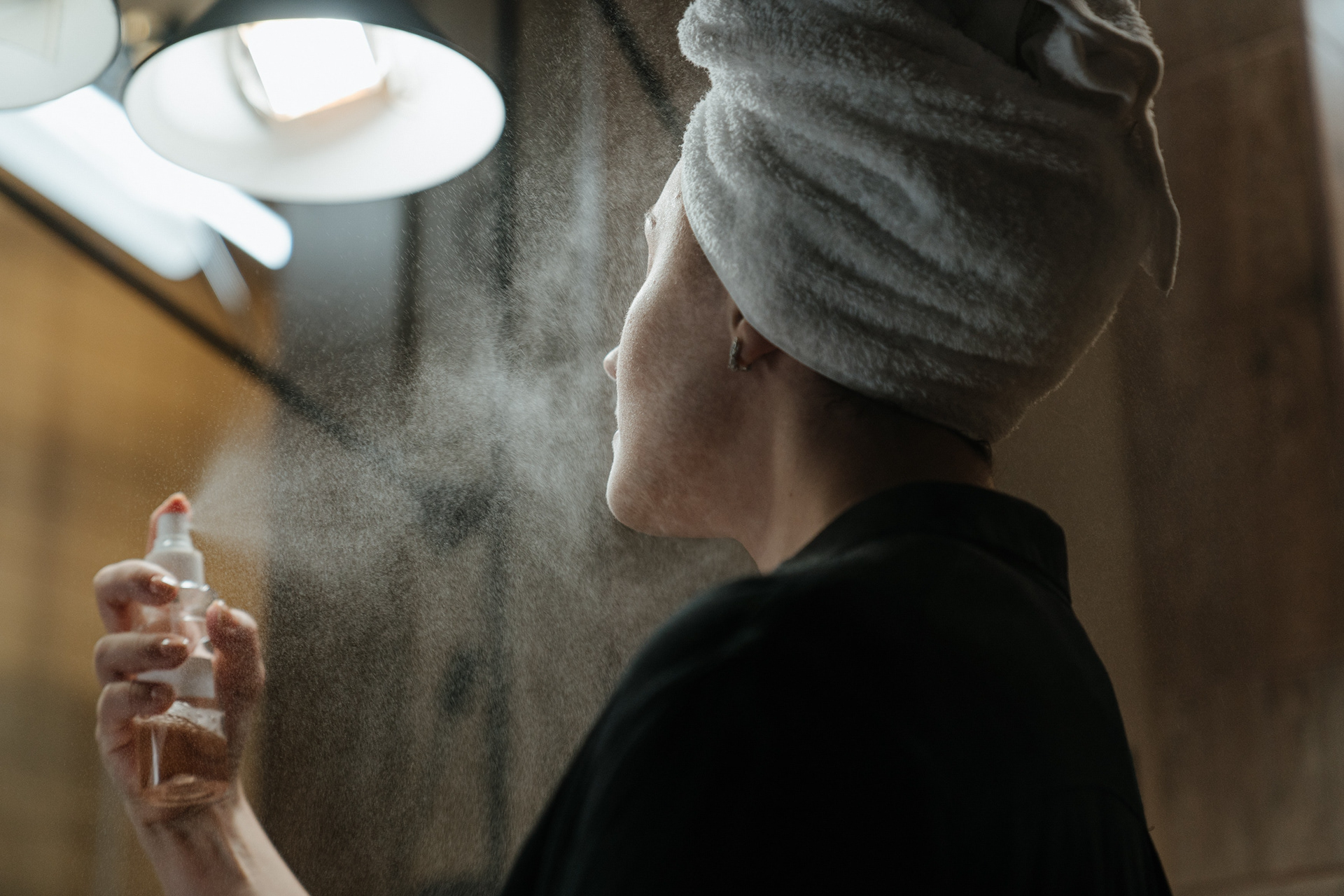
Beauty Professionals

Designers
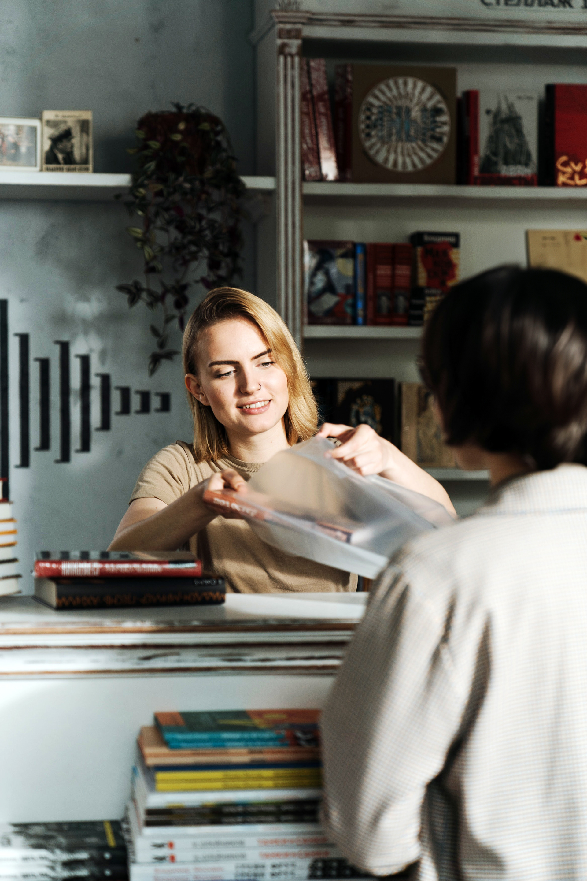
Small Business
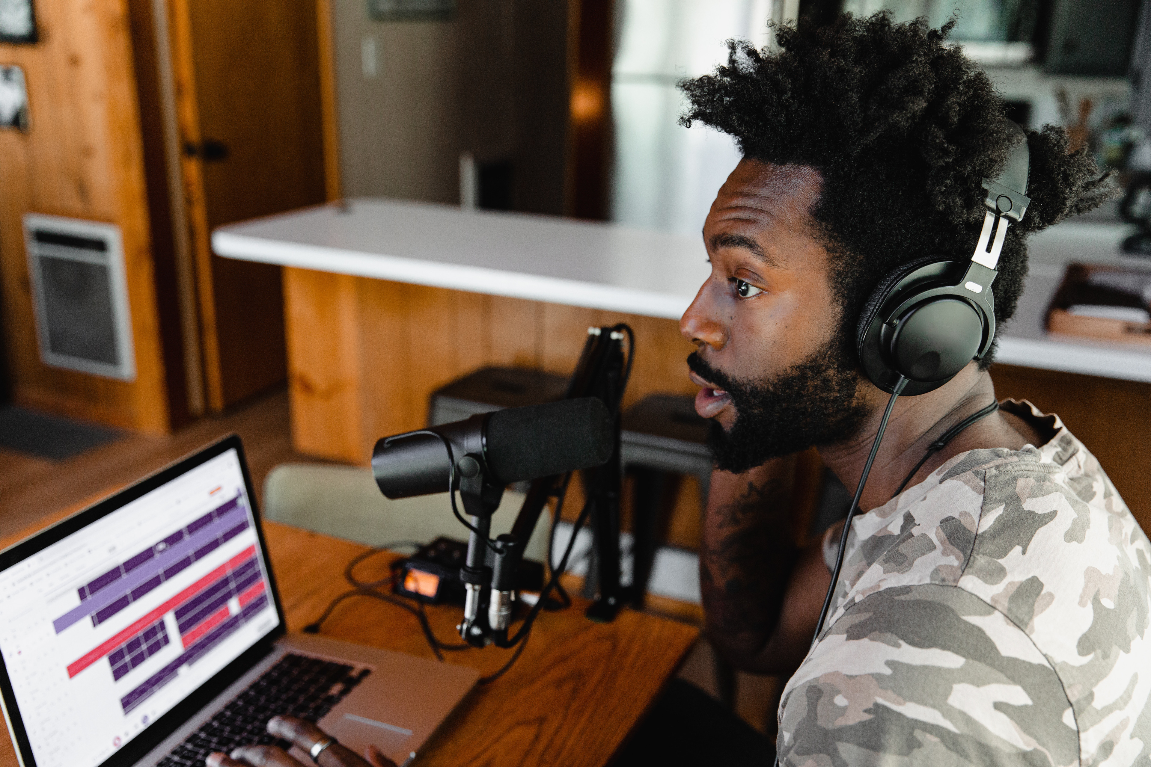
Podcasters
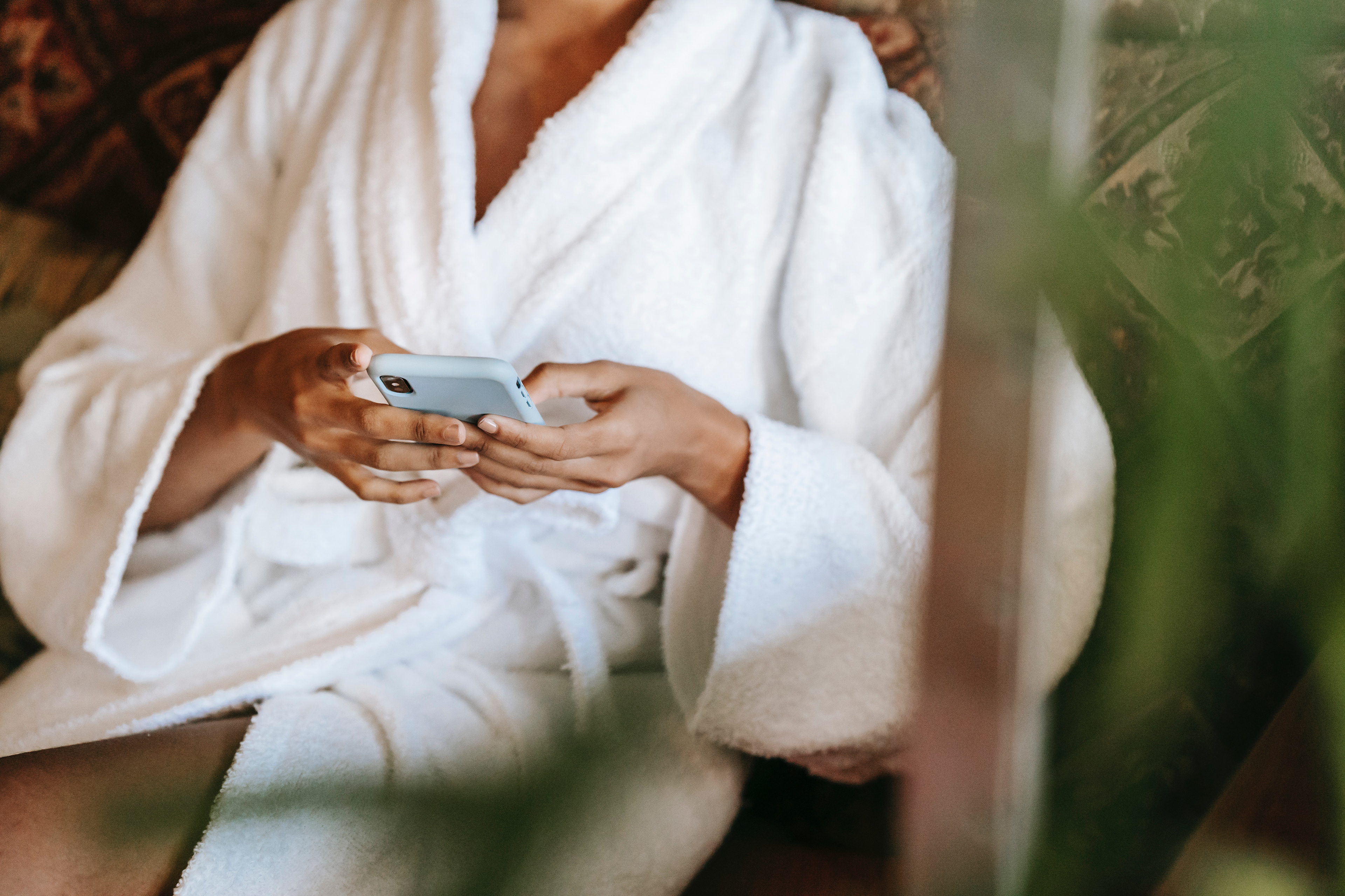
Health & Wellness

Podcasters

Health & Wellness

Photographers

Influencers

Photographers
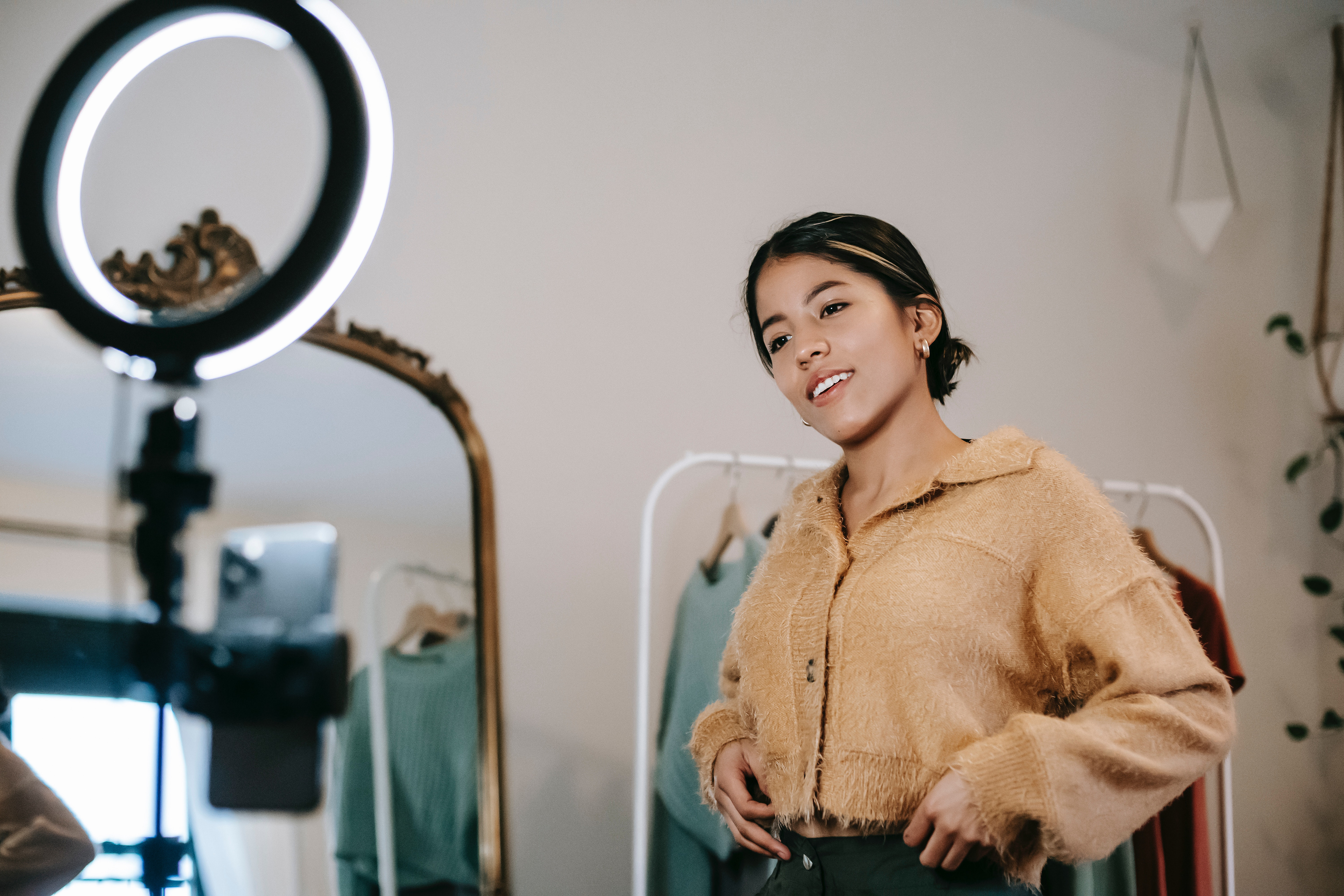
Influencers
Podcast landing page interface graphic.
Visit the Showit Dribbble account.
I planned a strategy to utilize the Dribbble platform to get in front of more Designers to allow Showit to become a household name for anyone looking to level up their web design game. I templatized our approach for varying post stylizations (general posts/marketing initiatives, ads, store templates for sale, Design Partner features, and more).
Our advertising efforts made over 3.3+ million impressions, reaching a hyper-niche demographic that proved to amplify our voice through the word-of-mouth advertising that trickles down (referrals to clients, partners, other designers, etc). Seems like a free throw to me, minus the foul. Basketball jokes 🏀🤌🏻

A website builder that works just like you do - Ad

Create websites without restrictions - Ad
April Fool's Joke
1 Color

2 Color
Part of rebranding Showit included revisiting the previous Design Partner badge system and the DXP logo.
For the Design Partner badge, I aimed for visual weight balance and simplicity to ensure versatility in black and white, a single brand color, or even utilizing multiple combinations. It aligns with our design system's styling with proper color-pairing usage rules and the implementation of a singular line weight, allowing it to seamlessly integrate into our Design Partners' websites and marketing materials without distraction.
For the DXP logo, I drew inspiration from the previous version but opted for a custom lowercase font design to enable seamless and infinite rotation on the DXP (Designer Experience) landing page, ensuring a perfect mirror, even when upside down.
Visit the DXP page.


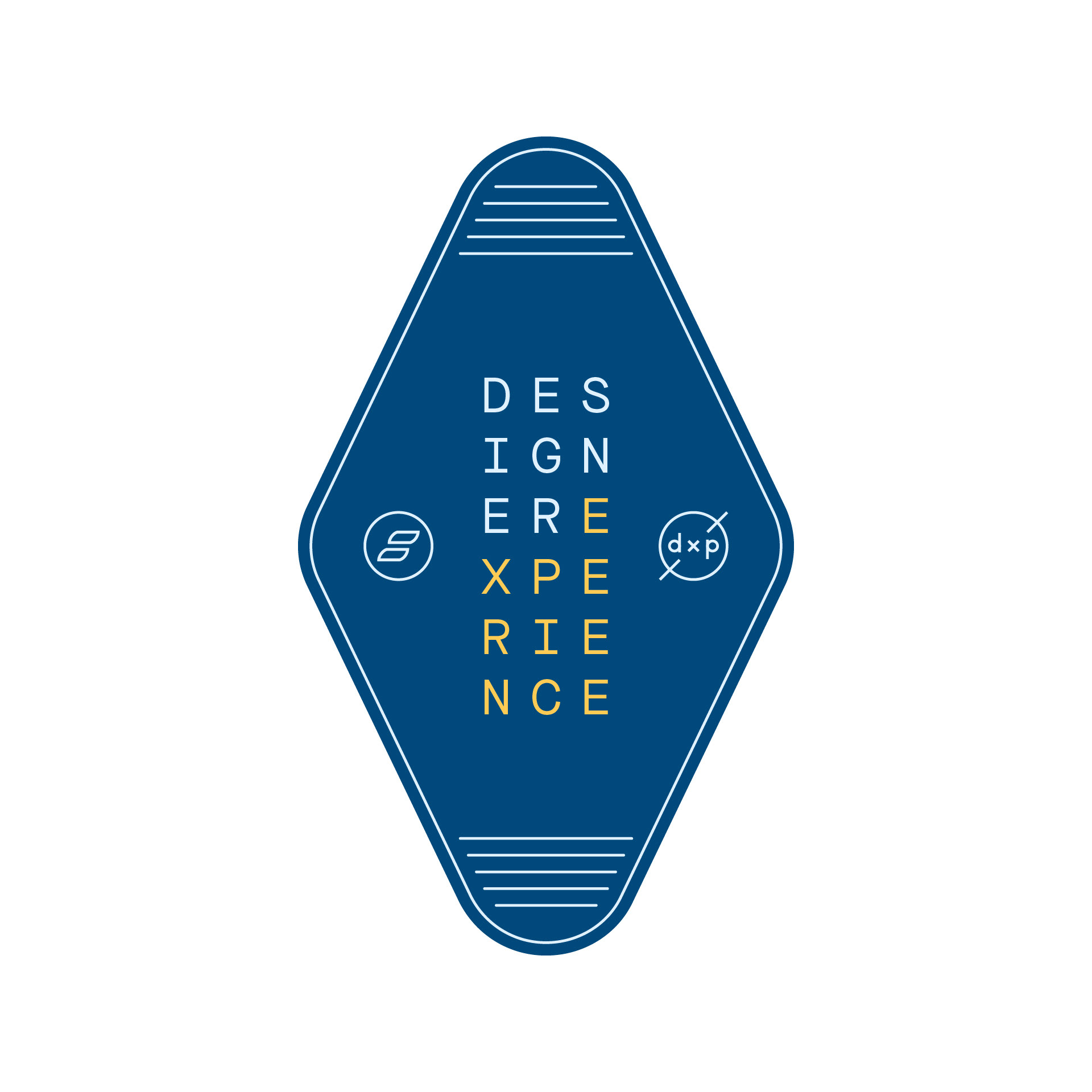
DXP - Hotel Key Tag
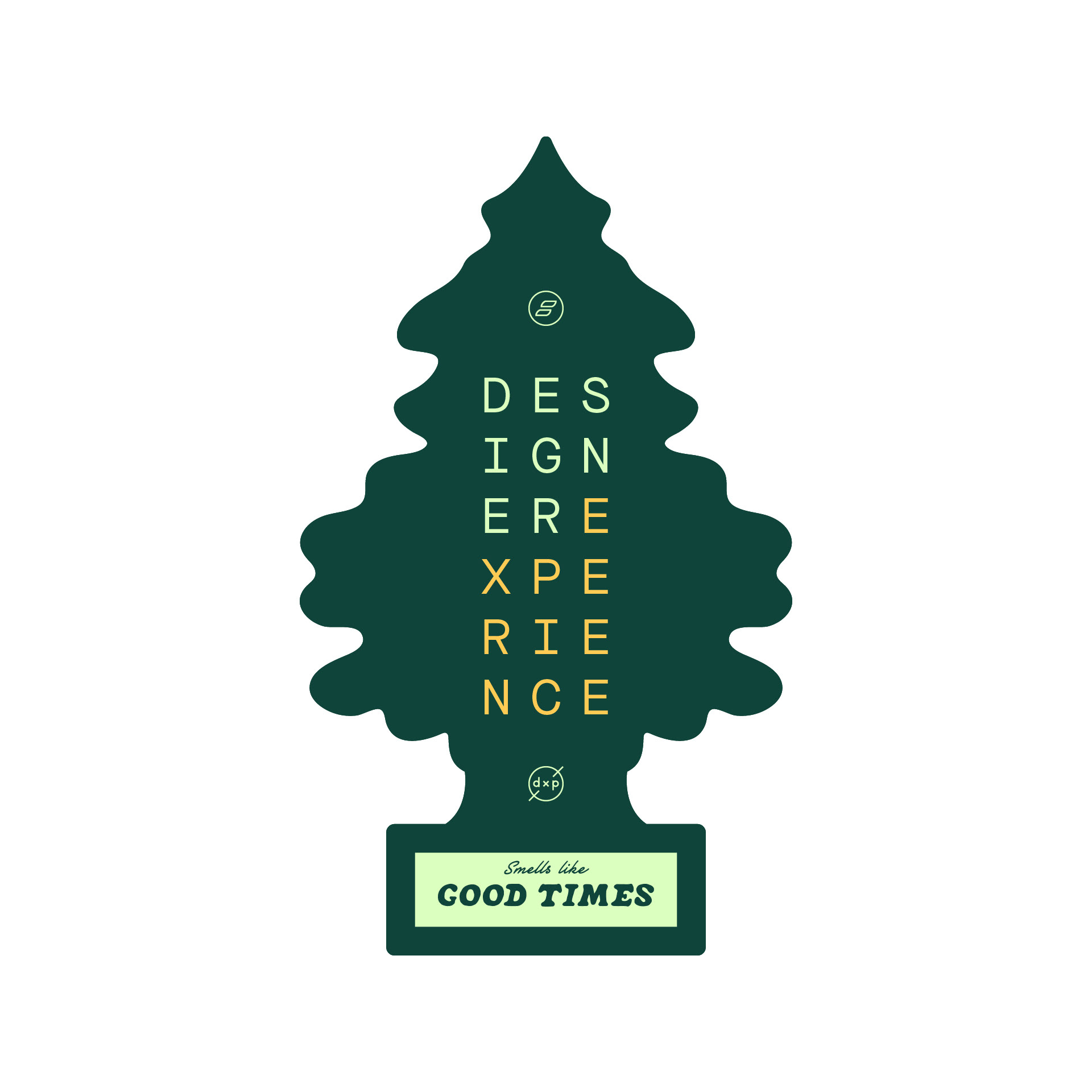
DXP - Car Freshener
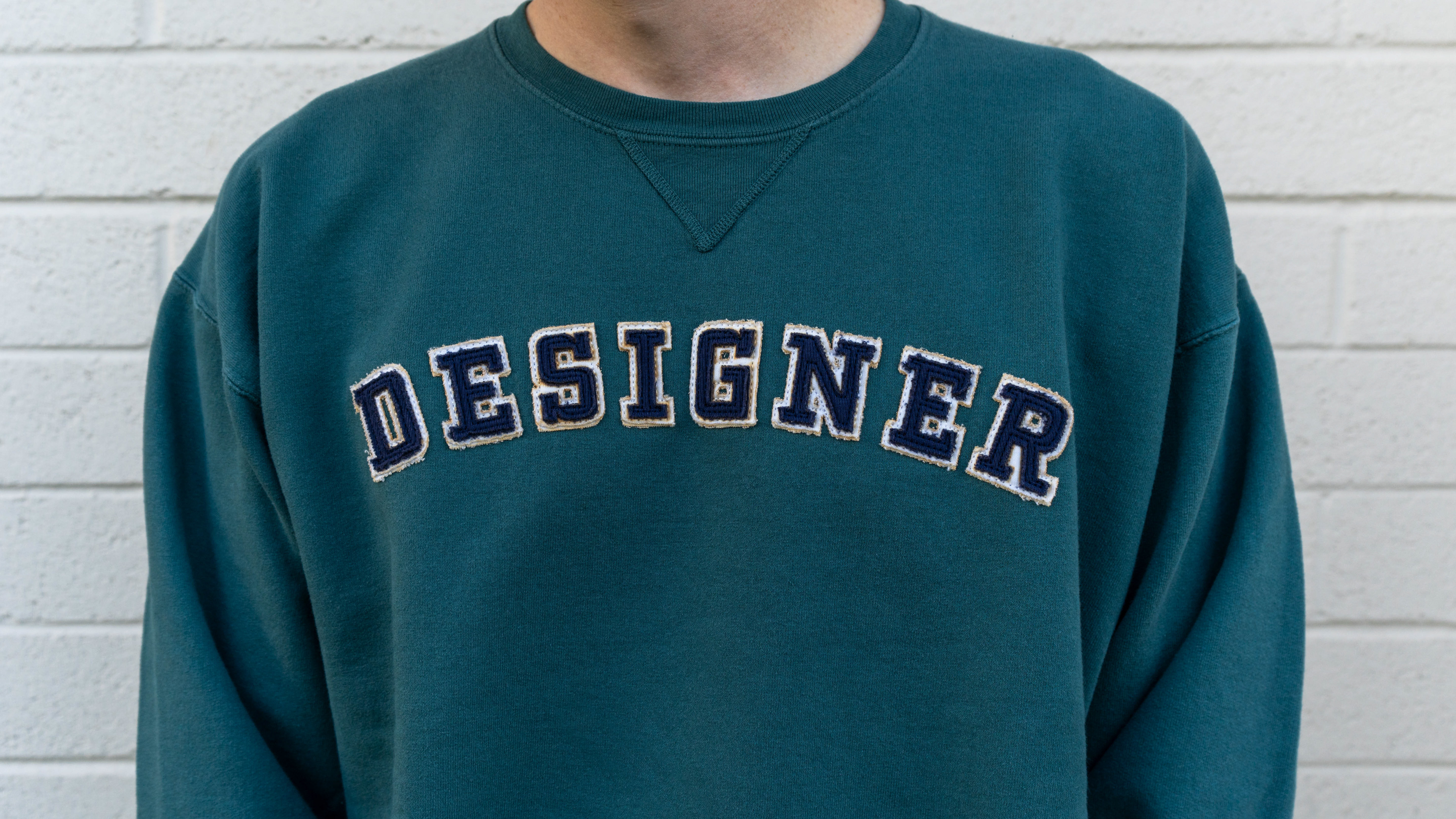
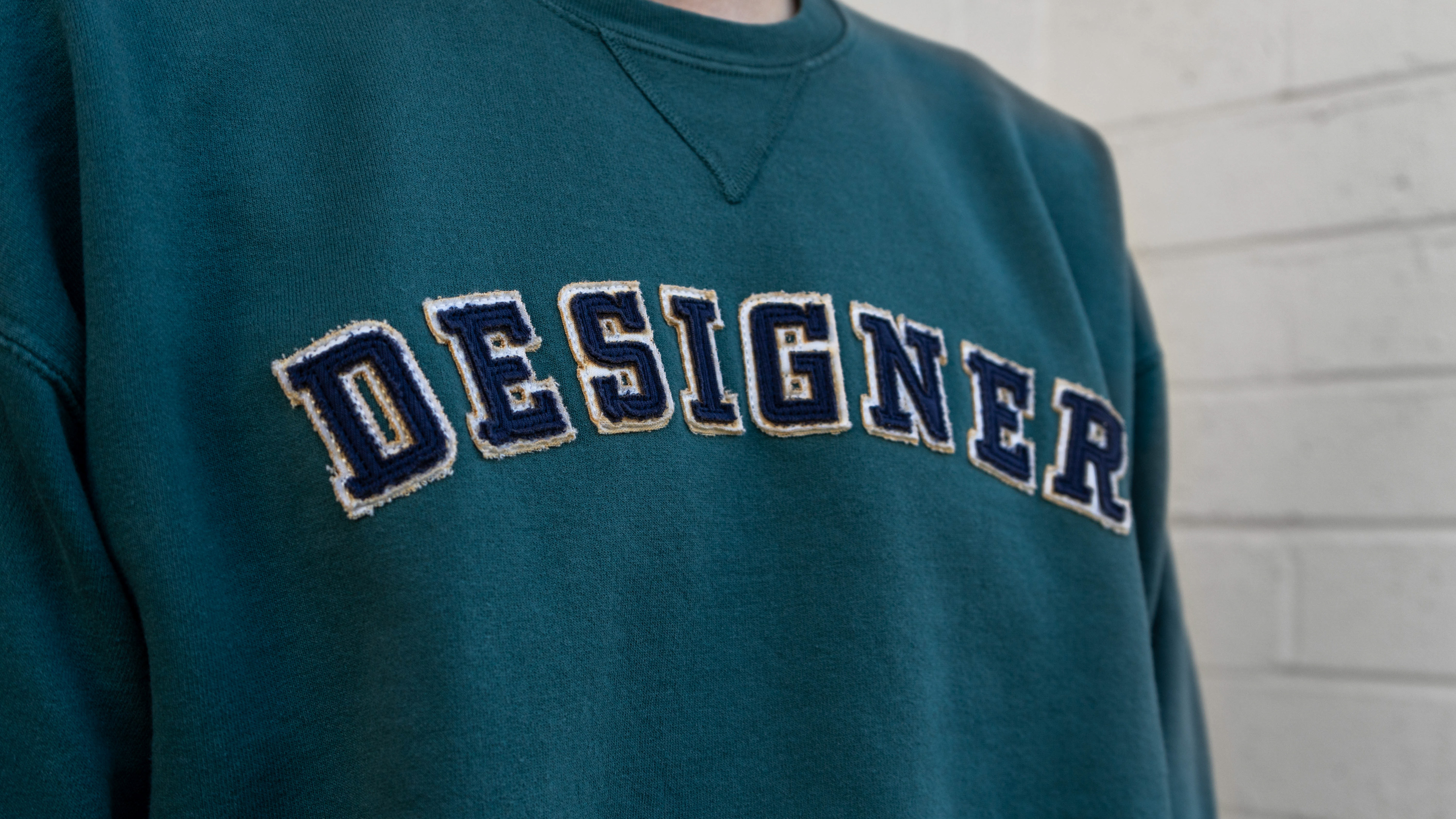
Mockup to envision the idea for approval
Production in reality – Photo by Ethan Sees
I wrote the copy for I Know My Quick Commands, Gif > Jif, Funktionality, Tap Tap, Swipe Up, Tag a Friend, Optimized for Web, and The Only Support I Need Is Showit Support stickers.
Copy for God is a Designer, Eat Sleep Design Repeat, and Create Like There's No CMND+Z by James Nwobu.
Copy for I ❤️ Showit and Go Rogue From Code by Chris Misterek.
Copy + Design for Drag & Drop It Like It's Hot by Jessica Reklaitis.
T-shirt option I designed for our annual marketing retreat.

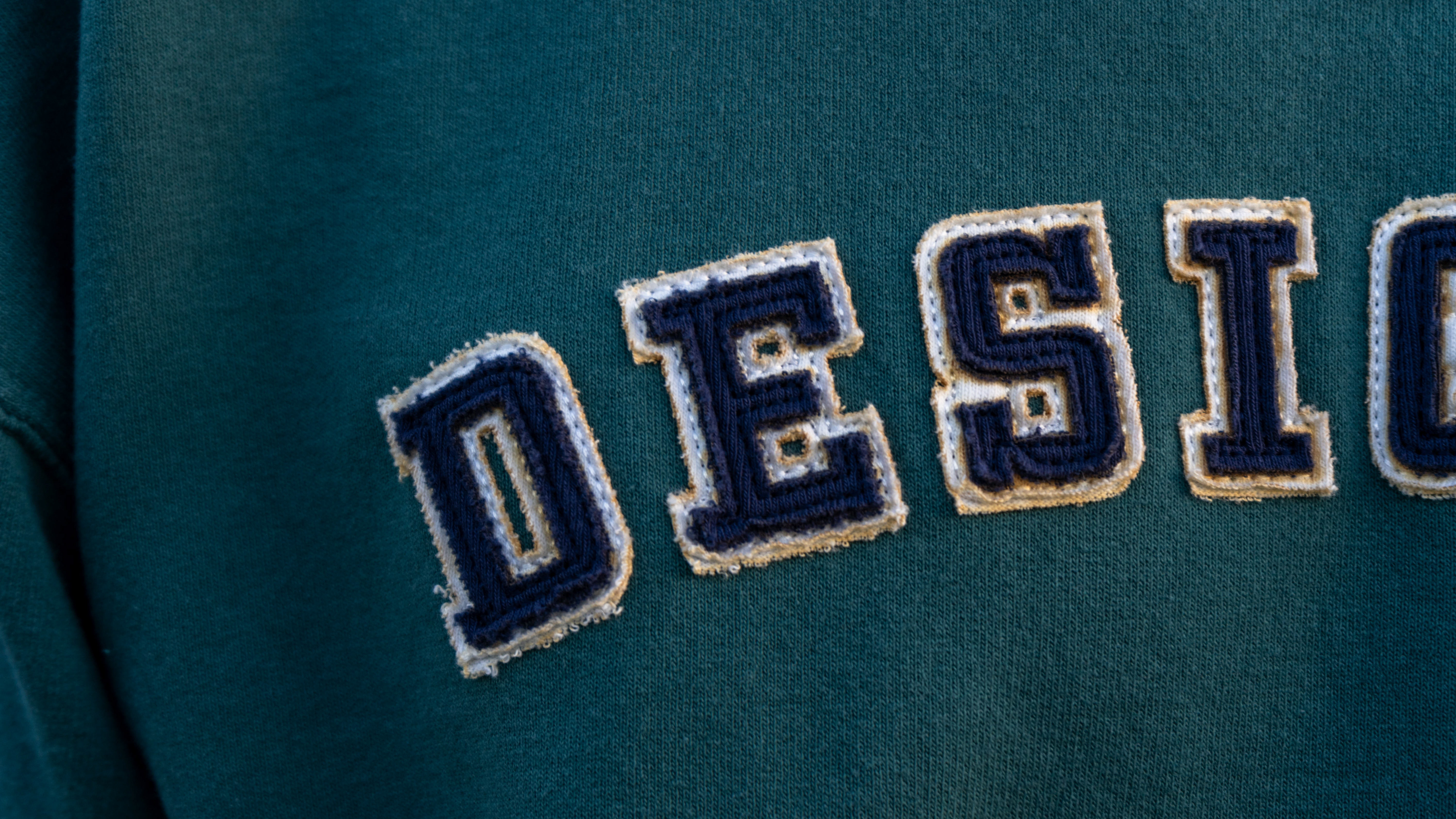
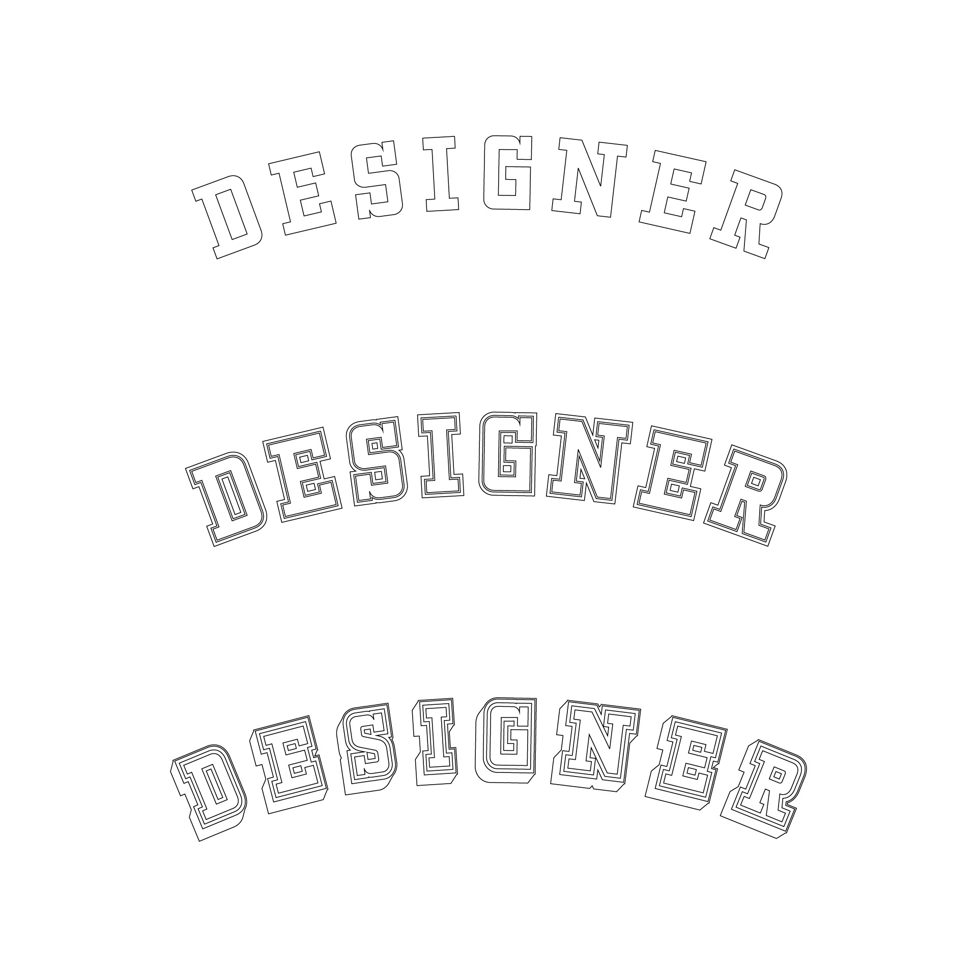
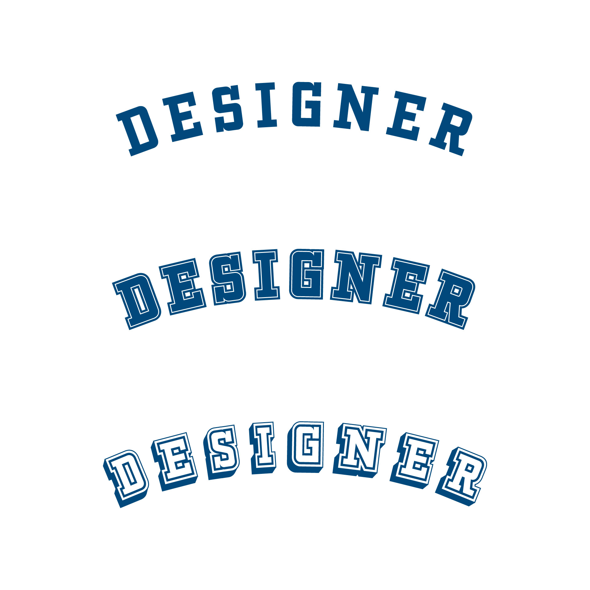
Black Colorway
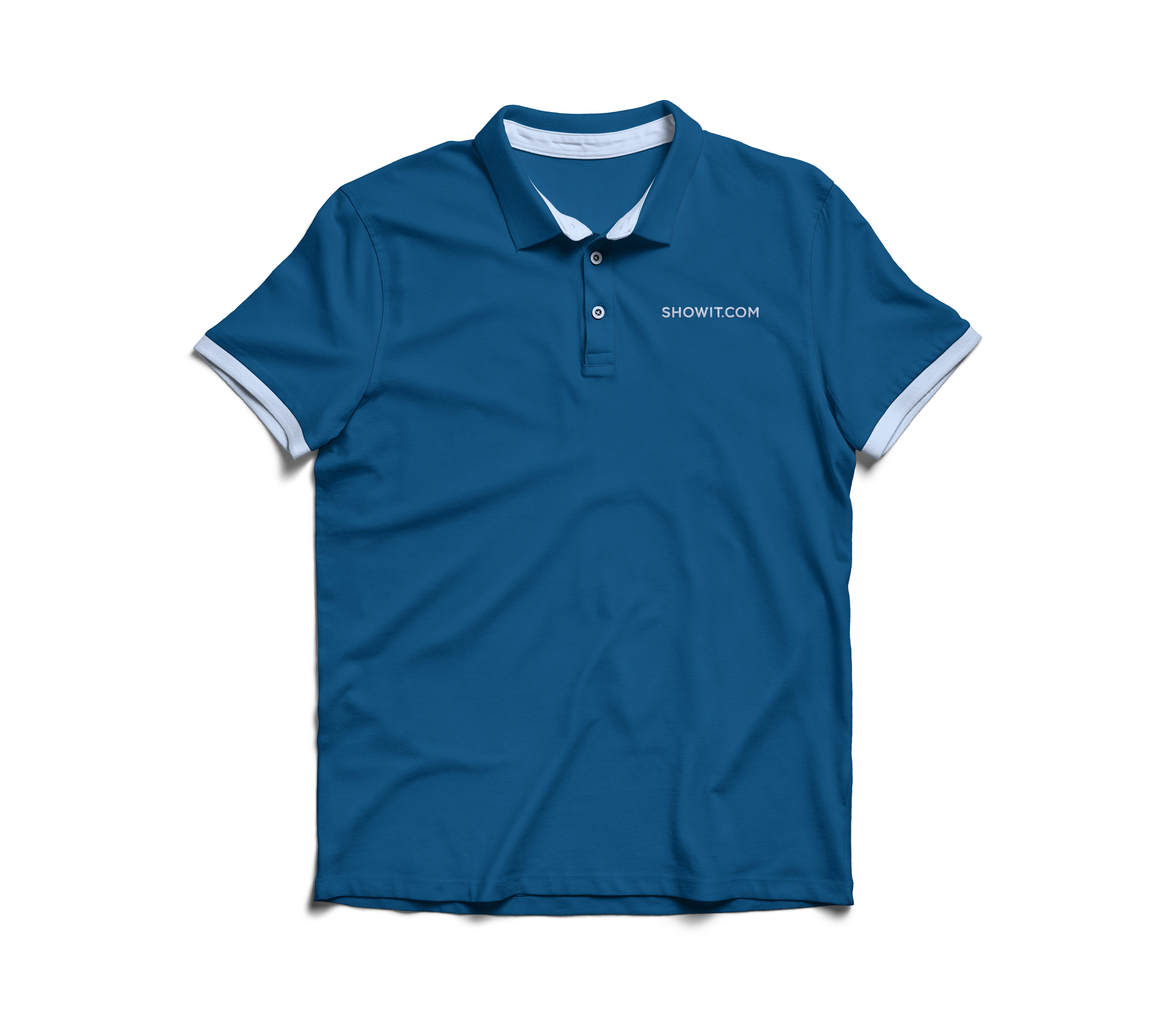
Subtle Colorway
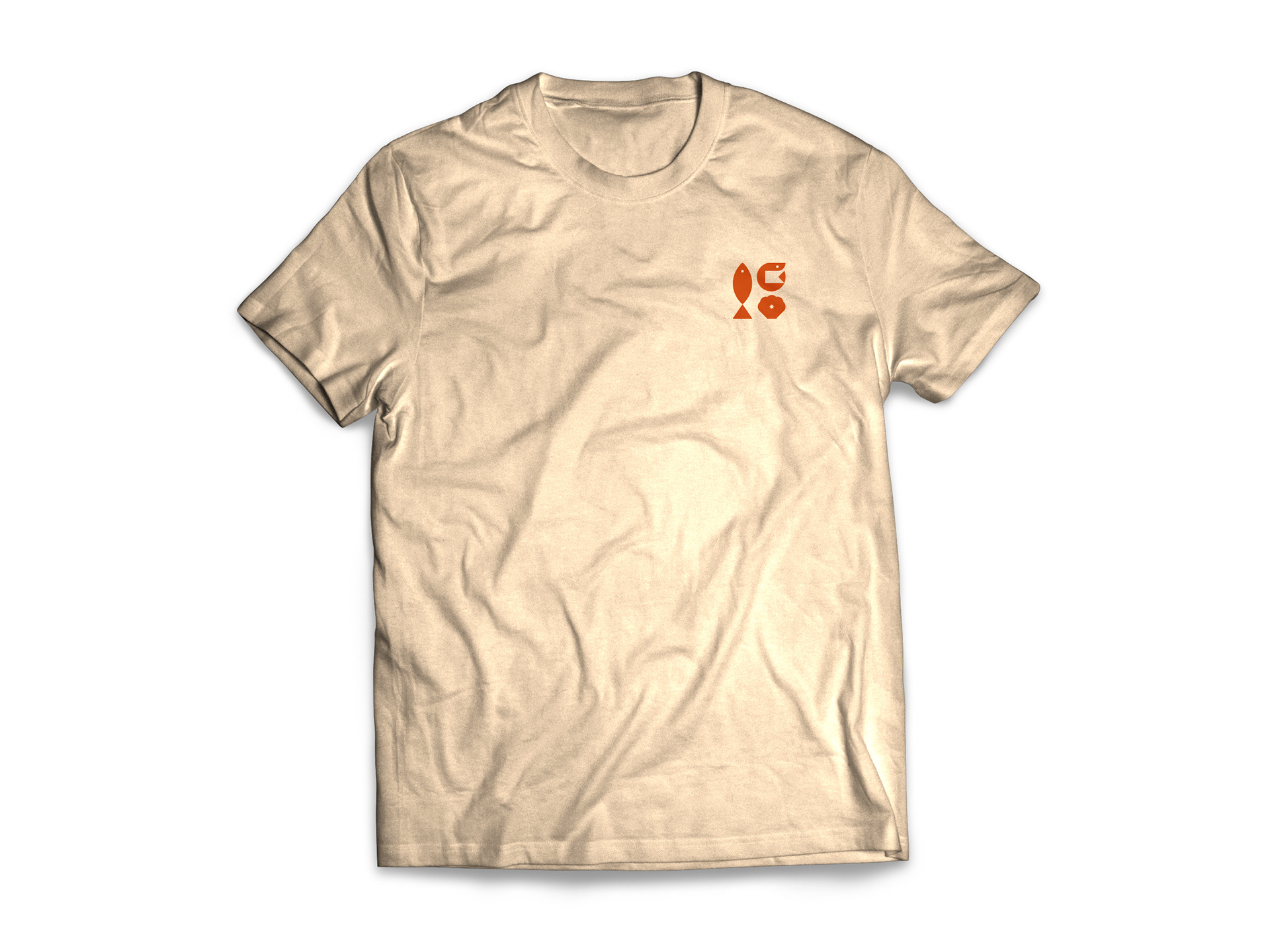
Shrimpsgiving T-Shirt - Front

Shrimpsgiving T-Shirt - Back
Pins I designed for Phoenix Design Week UNITE '23 sponsor booth giveaways.
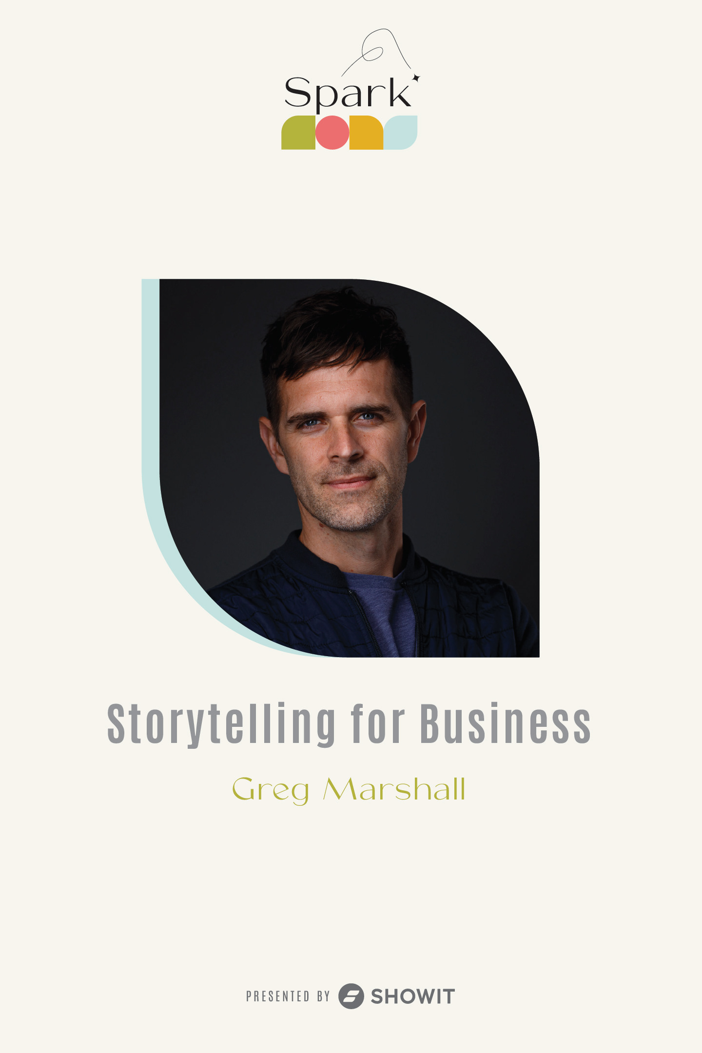
Logo concept for Spark '24 branding. View the Spark page.














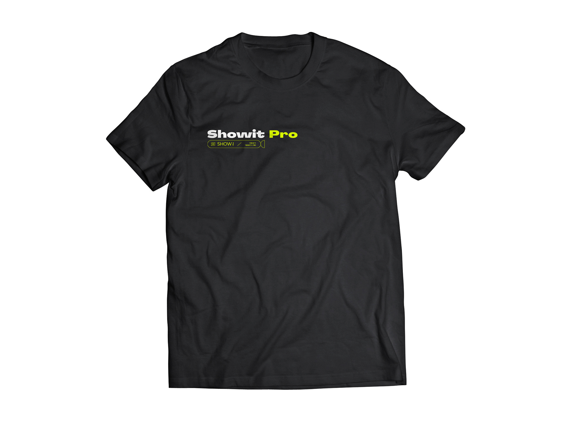
T-Shirt
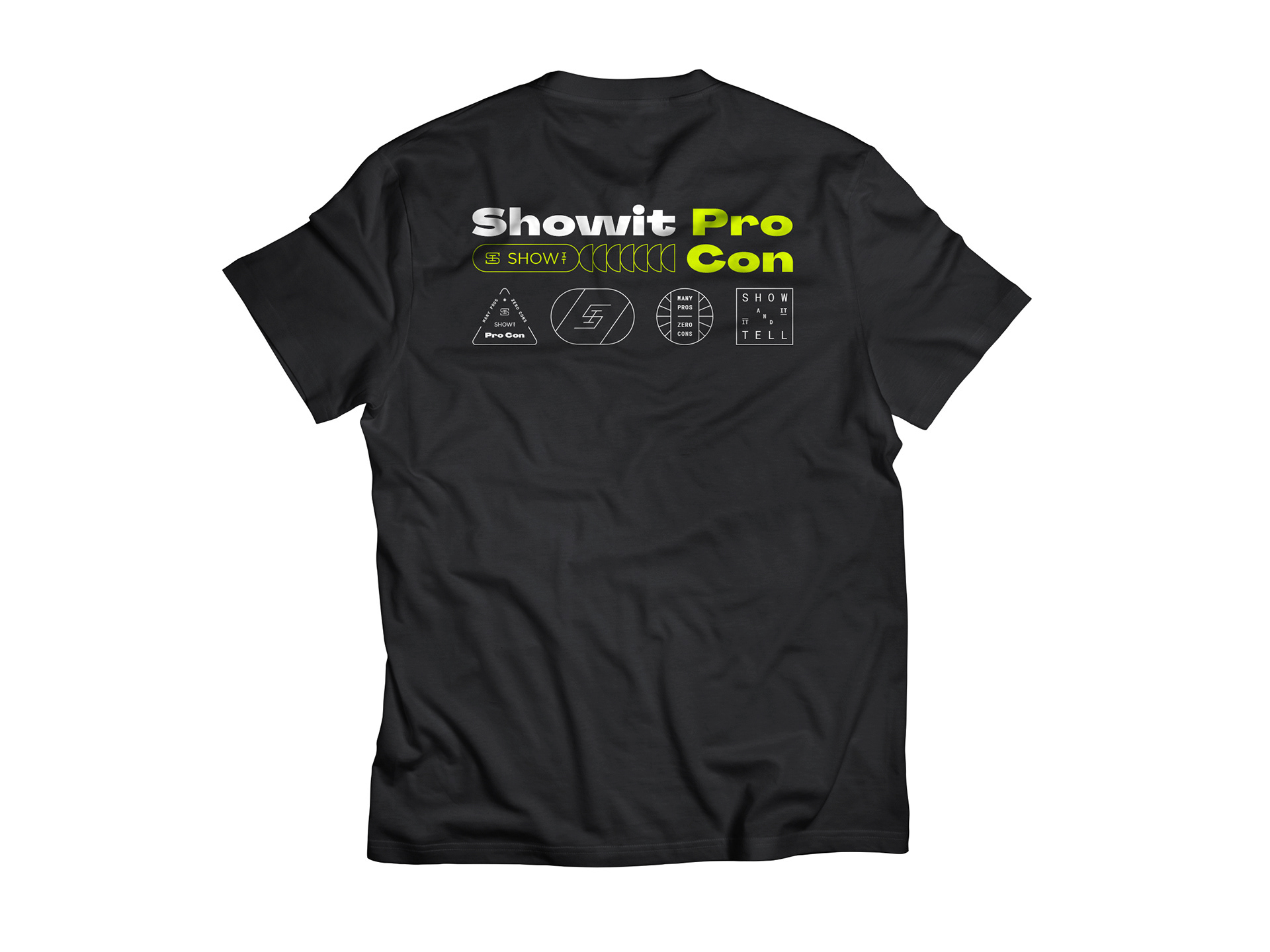
T-Shirt
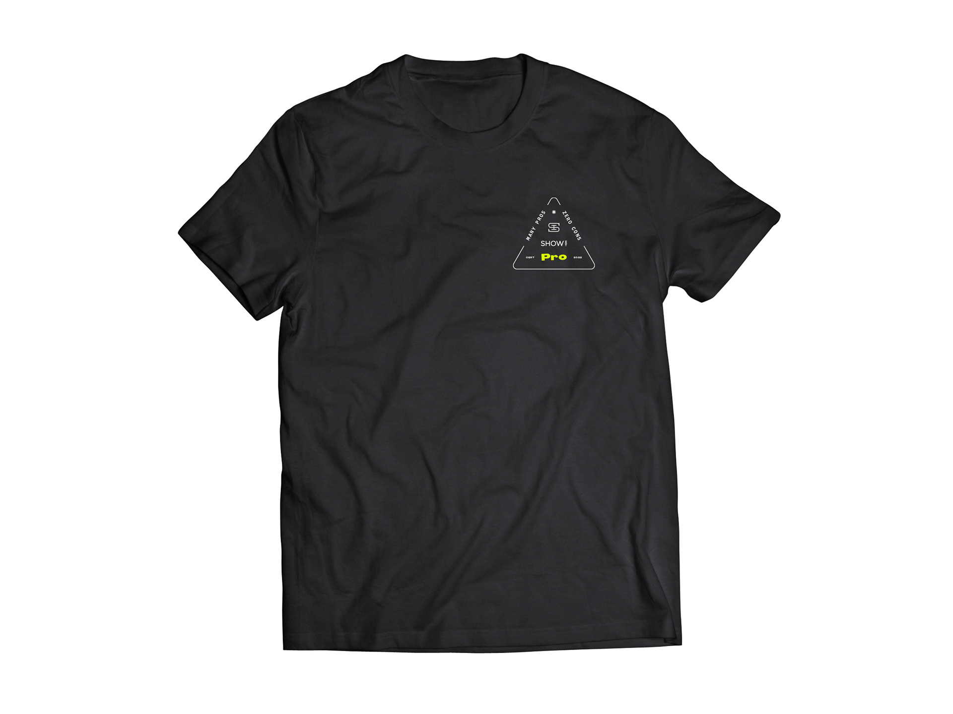
T-Shirt
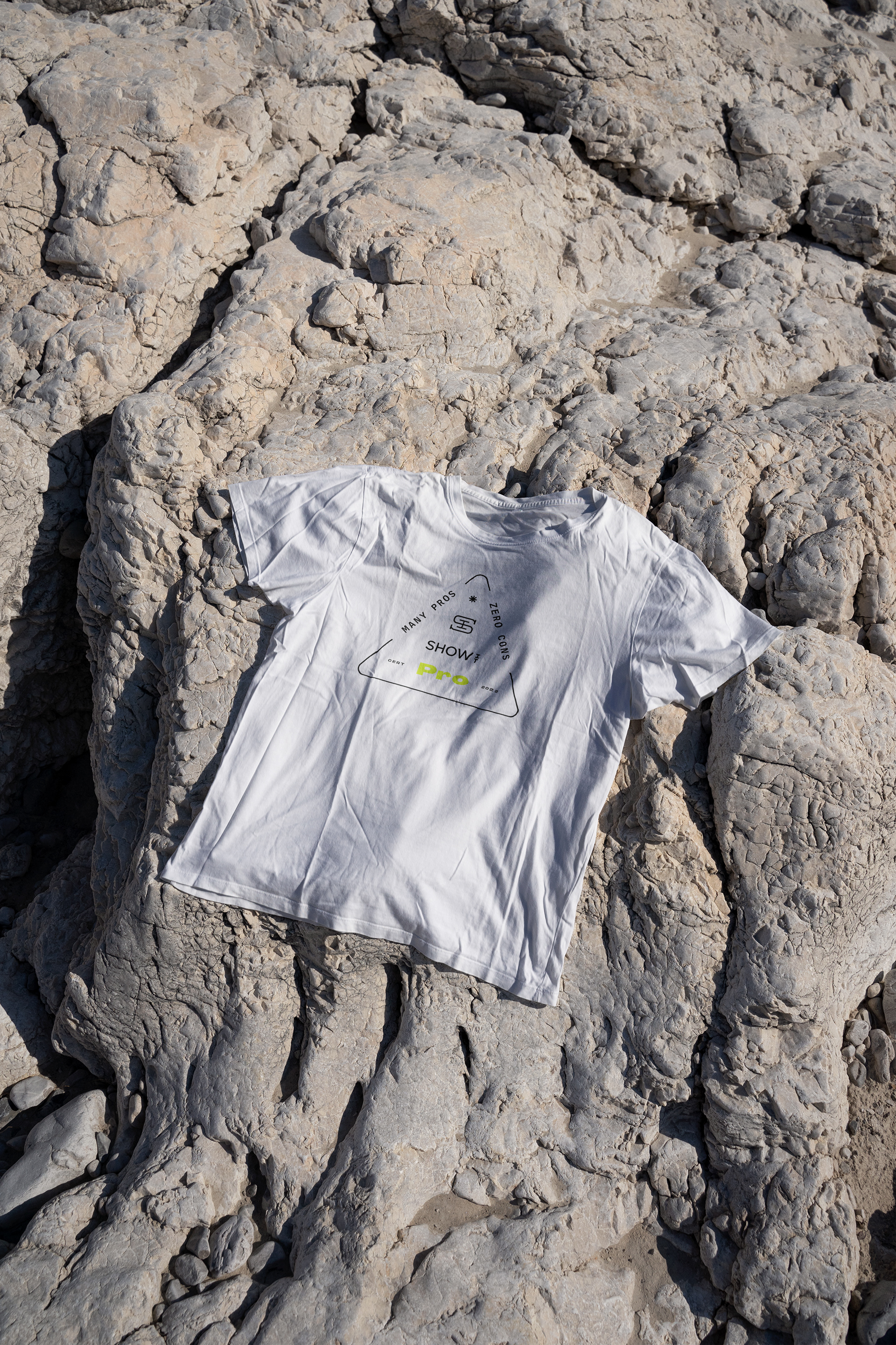
T-Shirt
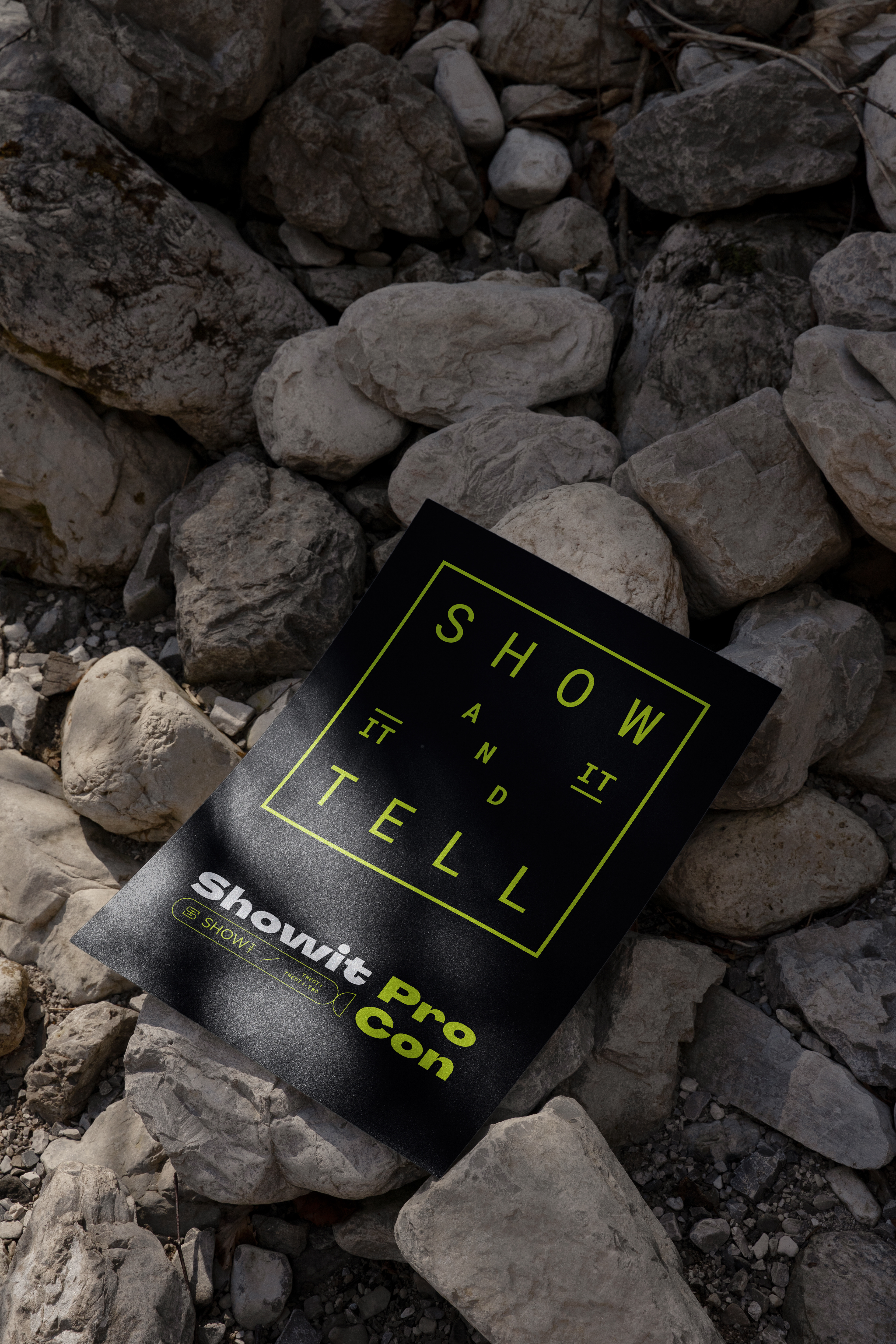
Poster
Beanie w/ Custom Monogram
Custom Monogram Die-Cut Pin
Custom Monogram Enamel Pin
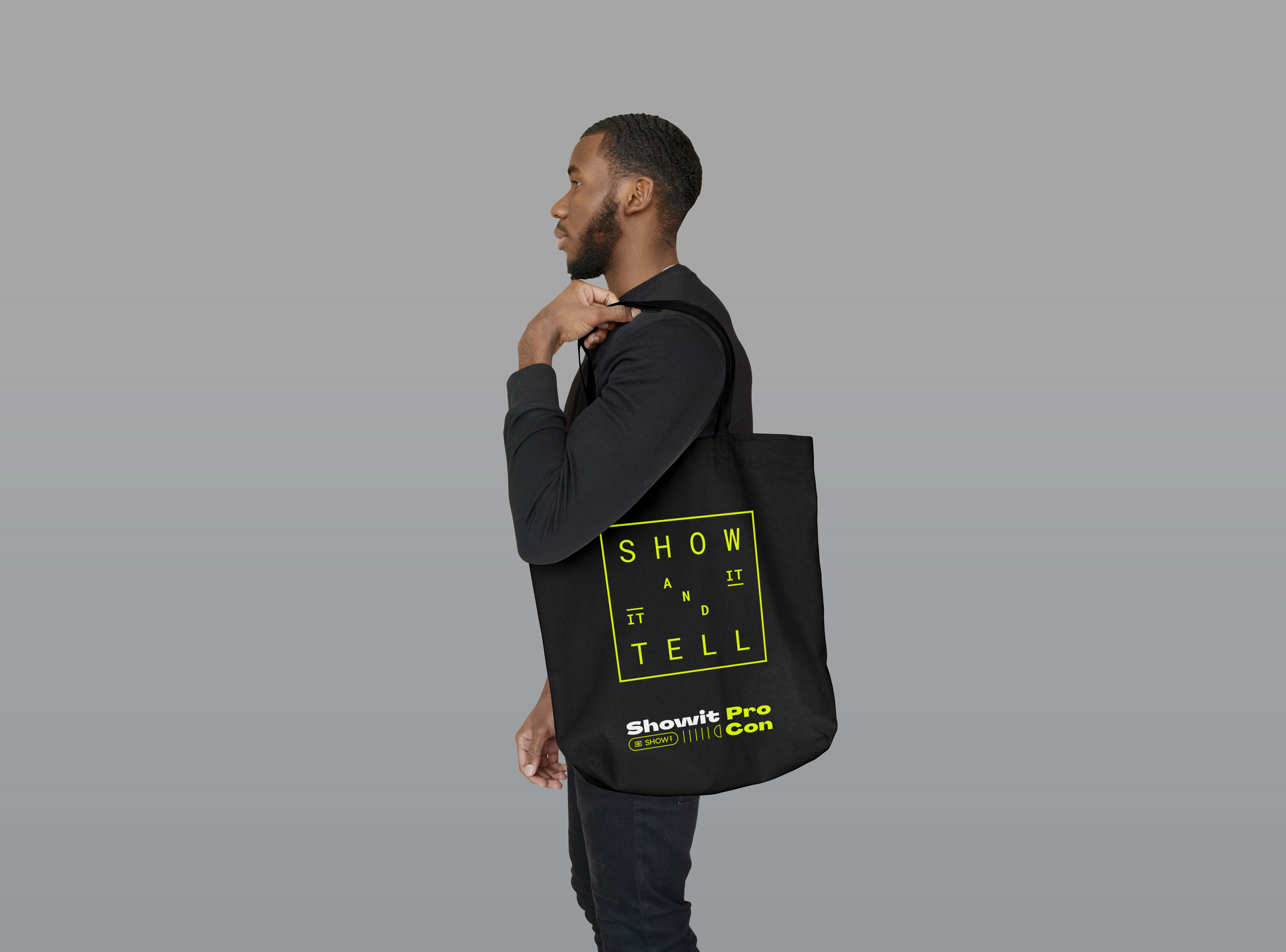
Tote
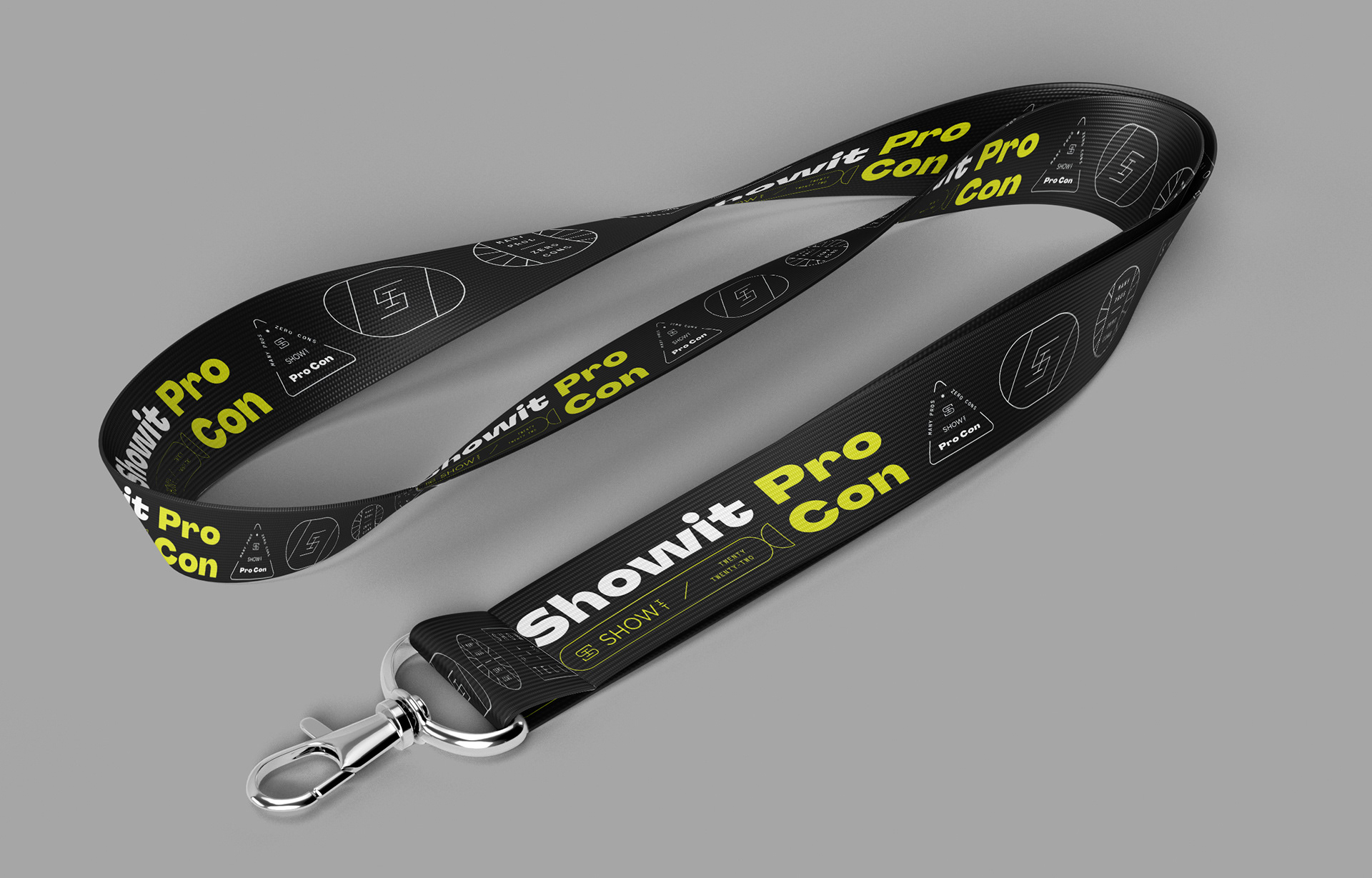
Lanyard

Lanyards

Schedule Side

Staff Badge
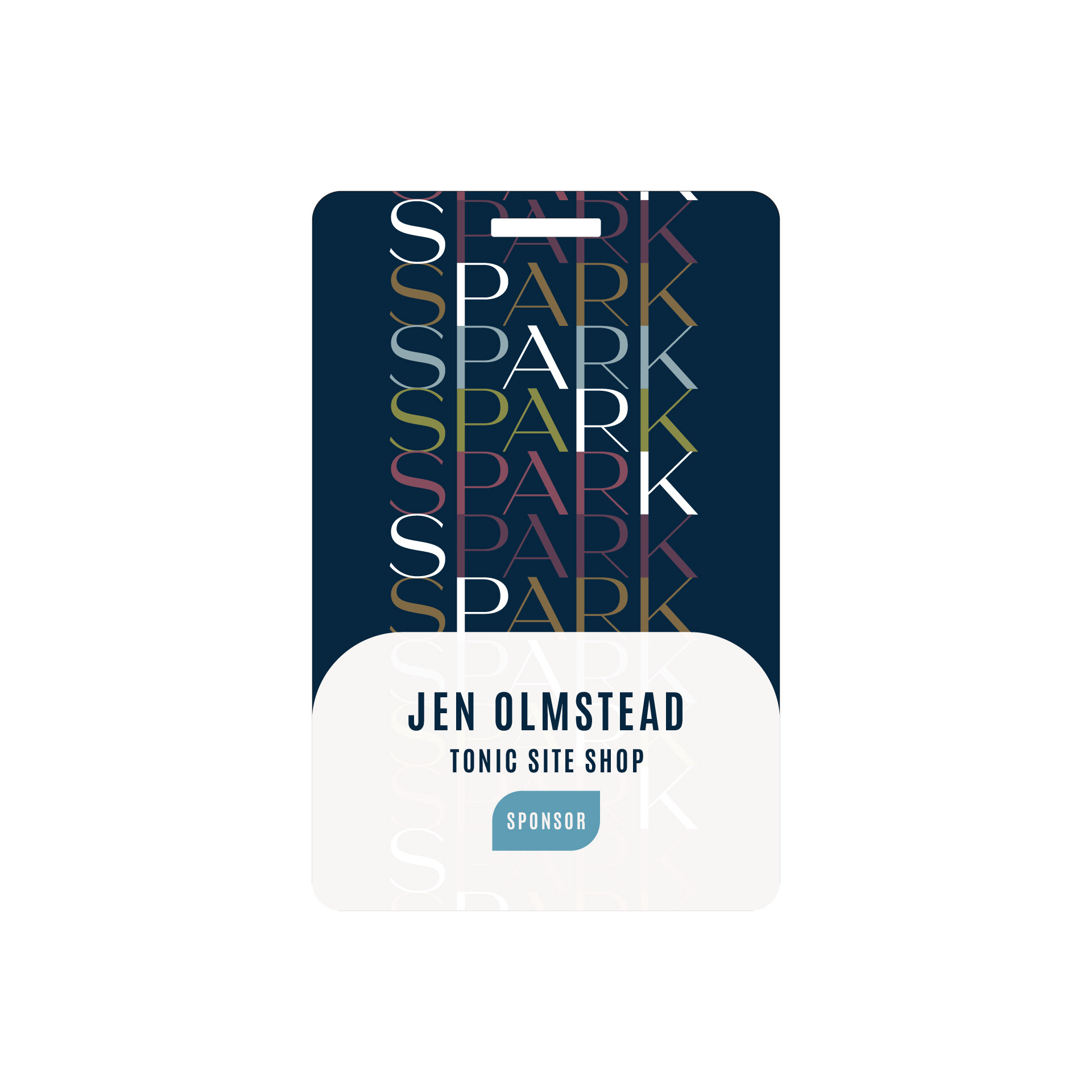
Sponsor Badge
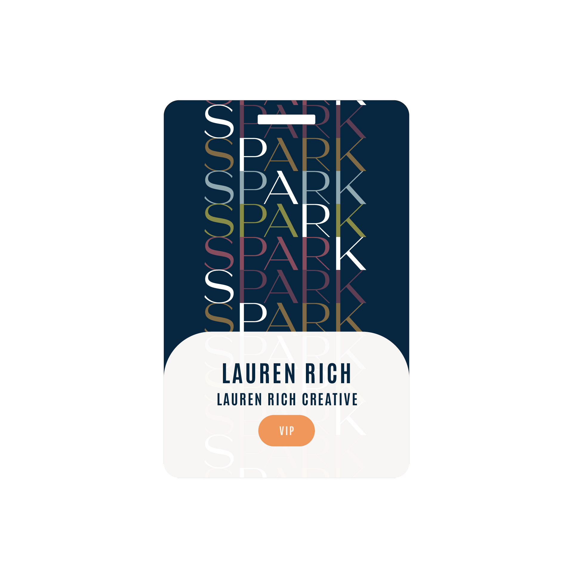
VIP Badge
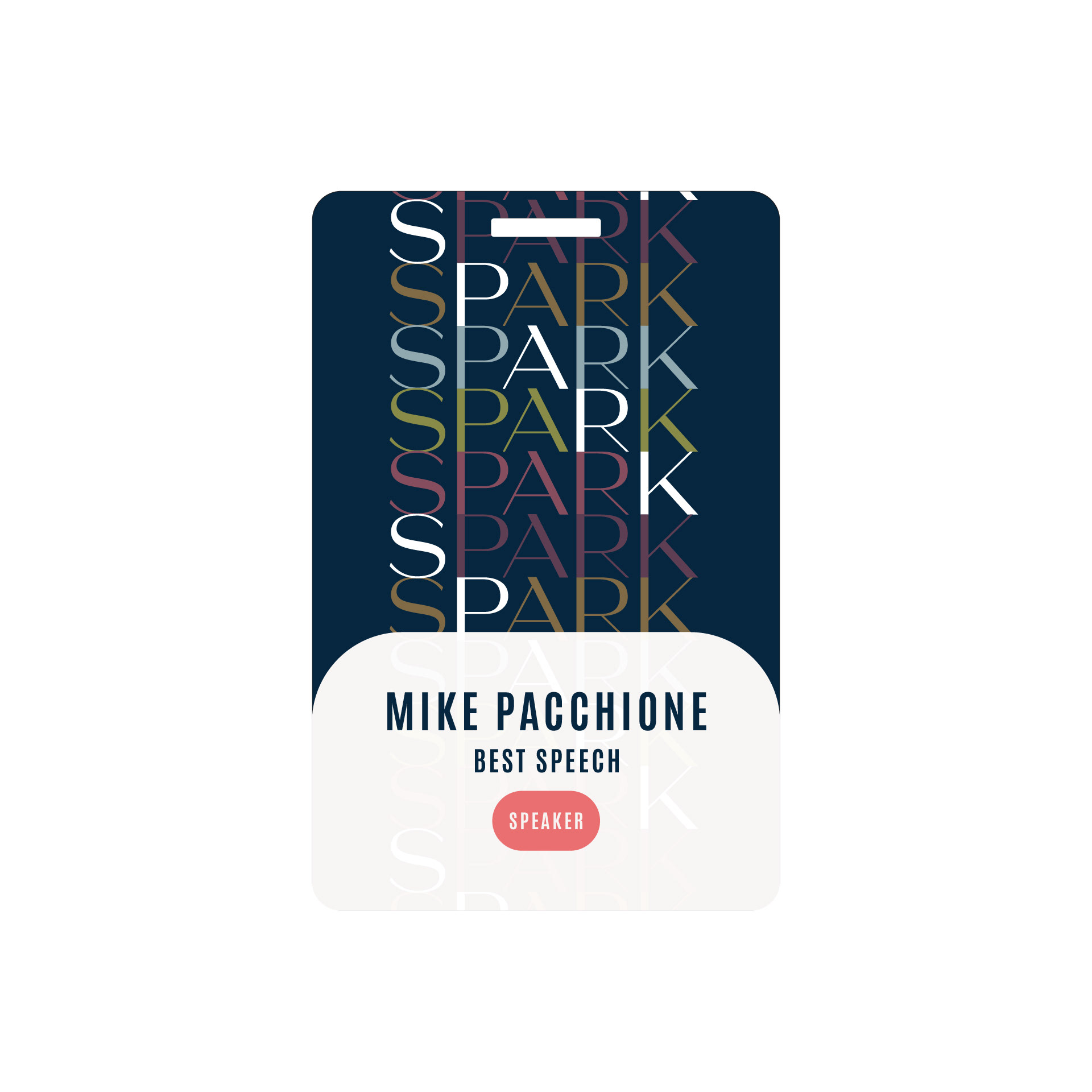
Speaker Badge
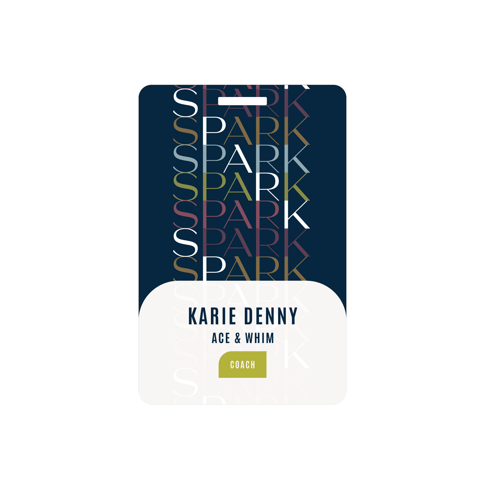
Coach Badge

Attendee Badge







Moment connecting with Showit users and Spark '22 sponsors, Tonic Site Shop.
Showit office entrance.
Photo of the marketing department at our annual retreat in Puerto Vallarta.
